
Collin is passionate about data viz!
He is a geographer, after all!
Here are some of Collin's favorite visualizations from his research, and what they mean:Example 1: An animation created for my dissertation:
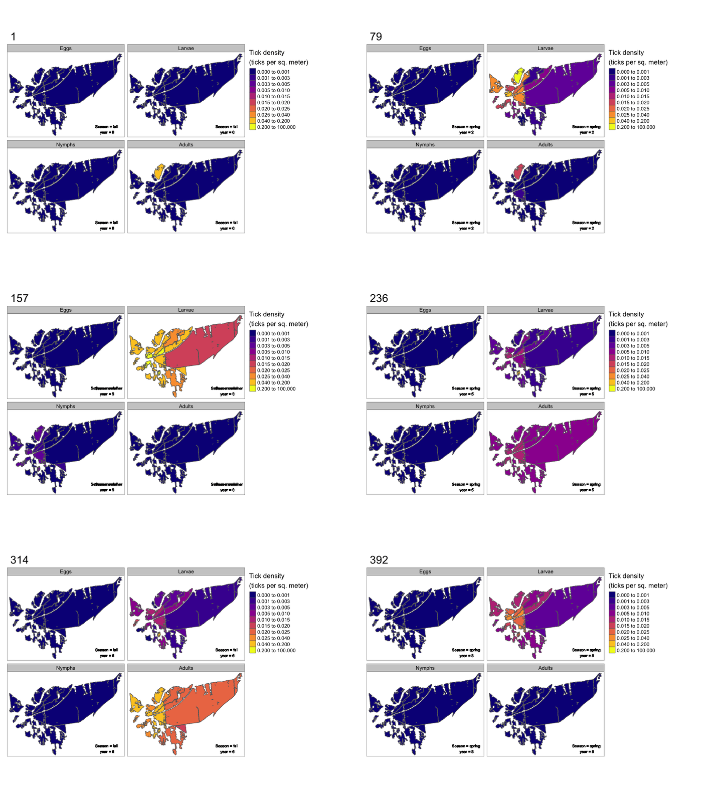 Dissertation title: Deer as Dilution Hosts: Testing Density-Dependent Mechanisms in the Ixodes scapularis and Anaplasma phagocytophilum Genetic Variant System.
This animation shows the simulation of a multi-scale hybrid and spatially-explicit agent-based model, called the spatial transfer of ectoparasite pathogens from tick interpatch connectivity, or (STEPTIC). The STEPTIC model works by simulating thousands of deer agents, tens of thousands of mice agents, and a dynamic number of tick agents (often hundreds of thousands). The goal of STEPTIC is to study how Ixodes scapularis ticks travel within and between forest patches, while also studying how pathogens travel through ticks and hosts. Model time is simulated in hourly timesteps, but is shown here aggregated to weeks.
Example 2: Figure 1 from my 2024 pre-print:
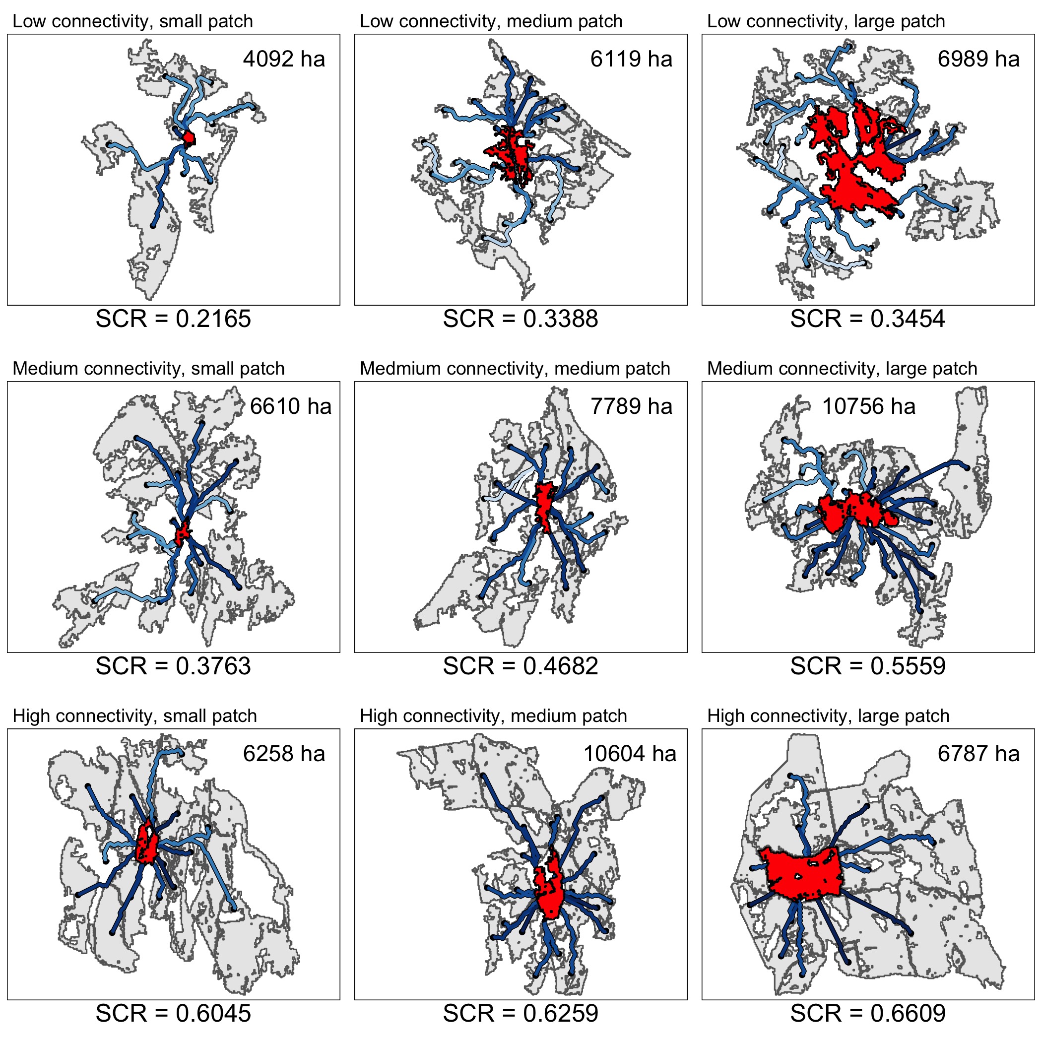 O’Connor, C., Aldstadt, J., & Wilson, A. (2024). Examining patch and landscape-level white-tailed deer connectivity using a novel, buffer and resistance-based metric. doi: https://doi.org/10.21203/rs.3.rs-4655632/v1
This figure serves as an example for the novel metric for forest connectivity Collin developed, called sinuous connection reduction.
Sinuous connection reduction is calculated in two parts, first, the size of the focal forest patch (shown in red) and second, the inverse sinuousity of the least-cost paths between adjacent forest patches (shown in blue.) Higher values of inverse sinuousity are shown here by going down rows, and higher values of focal forest patch area are shown by going across columns. The result is the forest with the highest sinuous connection reduction is shown at the bottom right, and the lowest is at the top left.
Example 3: An unpublished figure
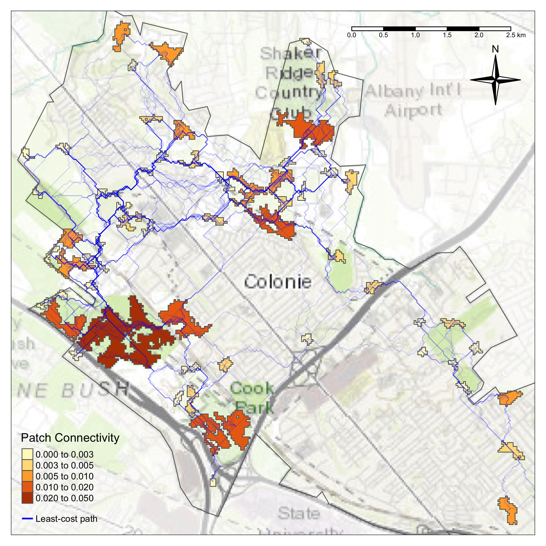
Though this figure is not published, it corresponds to the least-cost path mapping technique from example 2.
The figure displays the town of Colonie, New York and it's surrounding area. Polygons of disjointed forest patches are displayed, and calculated bi-directional white-tailed deer least-cost paths between forest patches are calculated and shown in blue. The least-cost paths are given a transparency in order to visualize which locations are "high traffic", that is, the more overlapping least-cost paths there are, the more likely deer are to use these locations to travel between patches.
Example 4: Figure 4 from my 2022 publication:
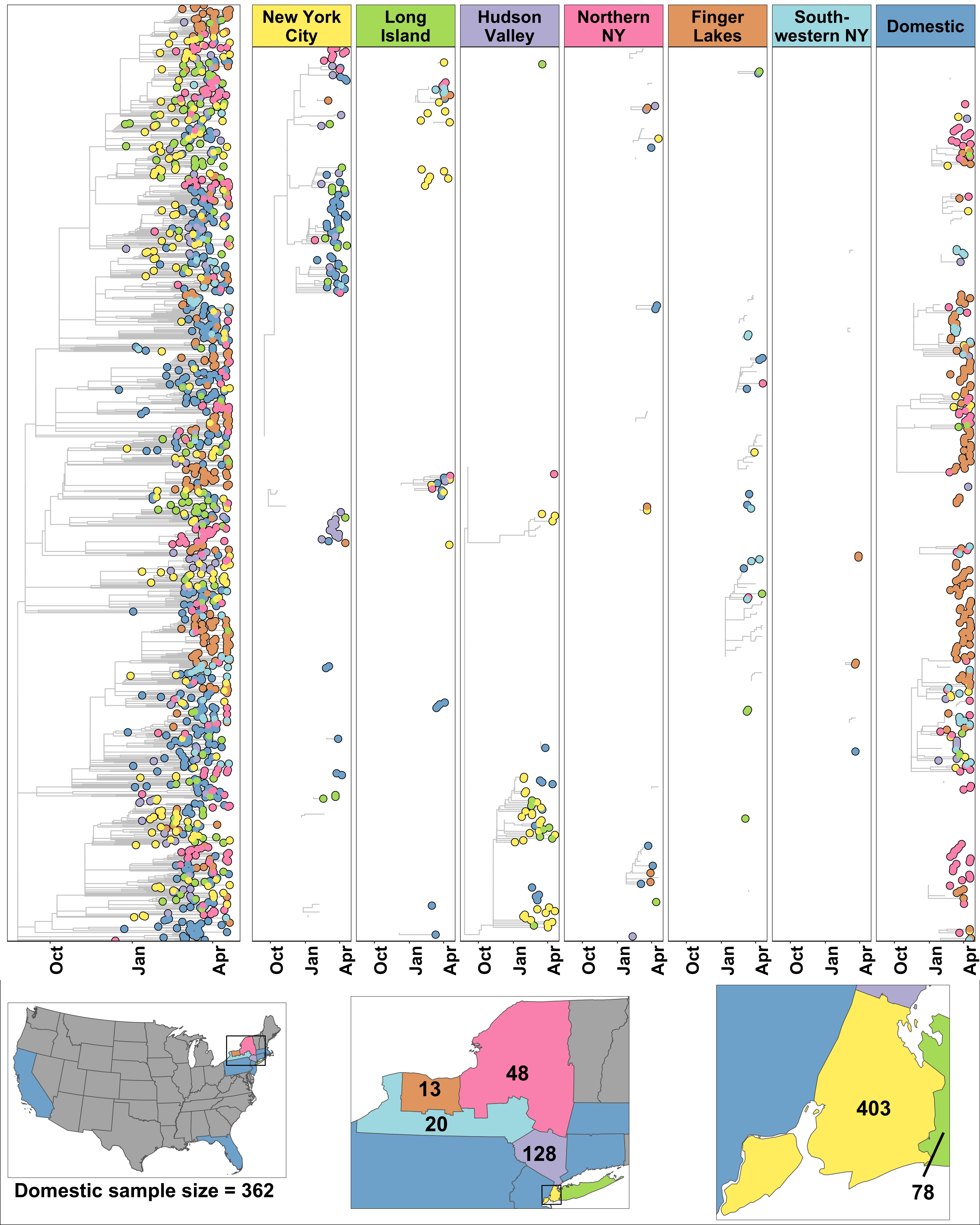 Russell, A., O’Connor, C., Lasek-Nesselquist, E., et al. Spatiotemporal Analyses of 2 Co-Circulating
SARS-CoV-2 Variants, New York State, USA. Emerg Infect Dis., 28(3). doi: https://doi.org/10.3201/eid2803.211972
Russell, A., O’Connor, C., Lasek-Nesselquist, E., et al. Spatiotemporal Analyses of 2 Co-Circulating
SARS-CoV-2 Variants, New York State, USA. Emerg Infect Dis., 28(3). doi: https://doi.org/10.3201/eid2803.211972
Though quite busy (phylogeographic analysis is quite complex!), this figure is just fun to look at. The analysis Collin and colleagues conducted involved examining SARS-CoV-2 genetic variant data from GISAID, particularly the B.1.1.7 and B.1.526 variants, to compare their spread into and around New York State.
The general takeaway of the study was that the B.1.526 variant (which emerged in New York City), exhibited a dominant outward spread consistent with implications from the founder effect. Comparatively, the internationally-imported B.1.1.7 variant exhibited outbreaks in less populated areas, due to it's competitive advantage in infectivity. This figure in particular, demonstrates that B.1.1.7 was imported into NYS, primarily the finger-lakes region, from various domestic sources.
Example 5: An animation from my 2023 publication:
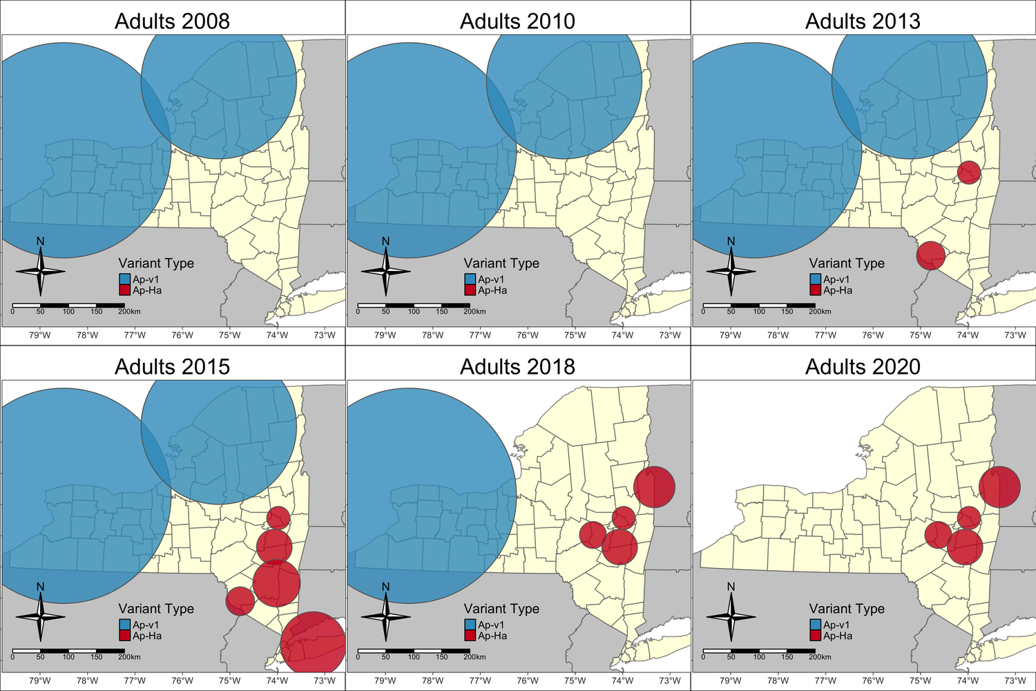
Prusinski, M. A., O'Connor, C., et al. (2023). Associations of Anaplasma phagocytophilum Bacteria Variants in Ixodes scapularis Ticks and Humans, New York, USA. Emerg Infect Dis., 29(3), 540-550. doi: https://doi.org/10.3201/eid2903.220320
This animation depicts Bernoulli space-time clusters of the pathogenic Ap-ha and non-pathogenic Ap-v1 genetic variants of Anaplasma phagocytophlium. The emerging clusters help describe the spatial heterogeneity of anaplasmosis cases in New York.
Example 6: Figure 2 from my 2024 publication:
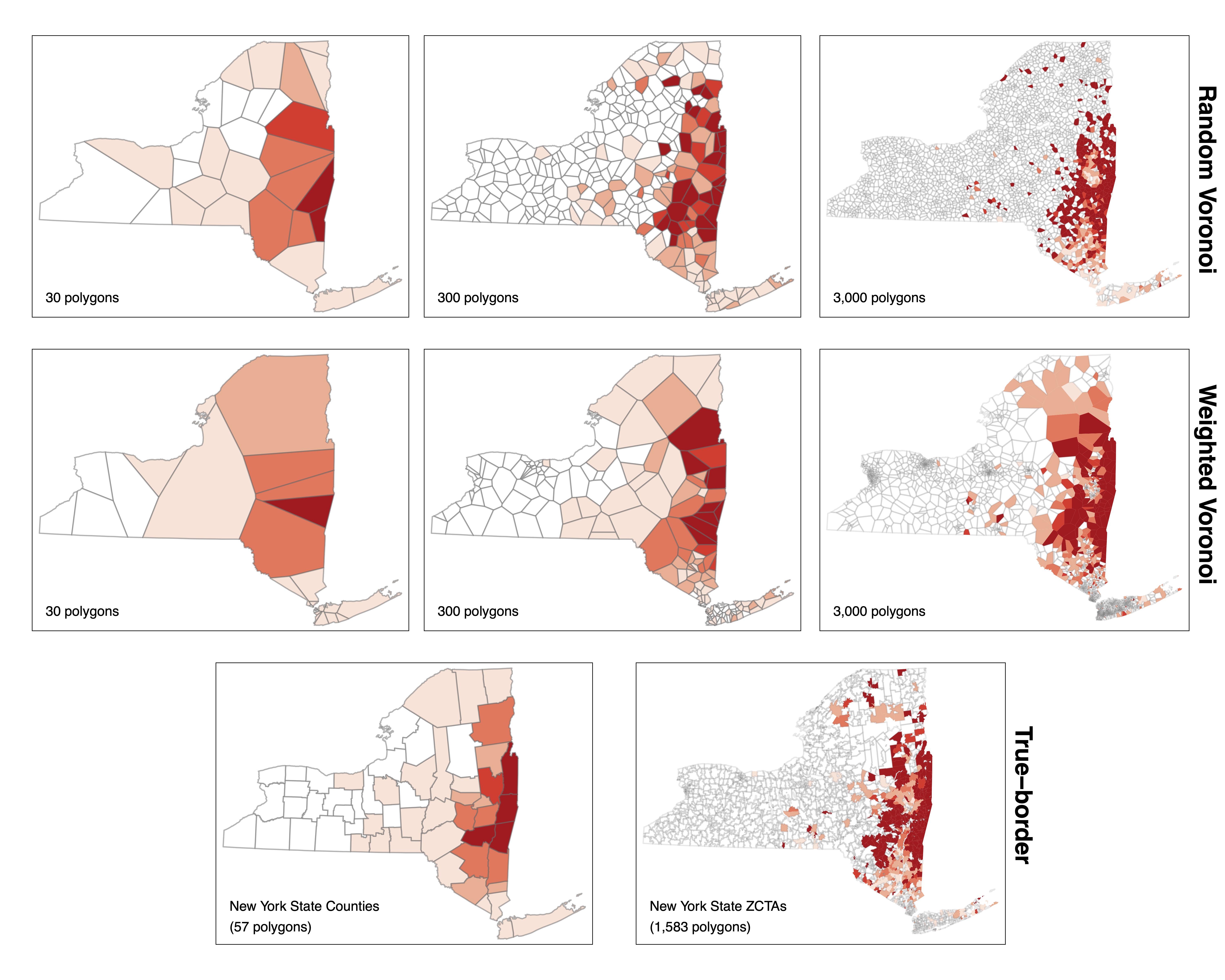 O'Connor, C., et al. 2023. Assessing the impact of areal unit selection and the modifiable areal unit problem on associative statistics between cases of tick-borne disease and entomological indices. J Med Entomol., tjad157. doi: https://doi.org/10.1093/jme/tjad157
This figure demonstrates the visual biases that occur when an underlying continuous phenomenon is aggregated into areal units. Here, Collin took a point pattern of anaplasmosis cases, and aggregated them into various meaningful (Counties and Zip Code Tabulation Areas) and non-meaningful (Voronoi) polygons. Clearly, the a point-process can appear more widespread when aggregated into larger units.